
Amtrak
has train routes across America. As a conceptual project, my team and I created an app redesign that would make people more comfortable with taking the train with the goal of increasing ridership.
Role: Researcher
Duration: 2 weeks
Contribution: I conducted 9 user interviews in order to understand hesitations around and delights in taking the train and communicate design solutions to the design team.
Platform: Mobile
Team size: 3
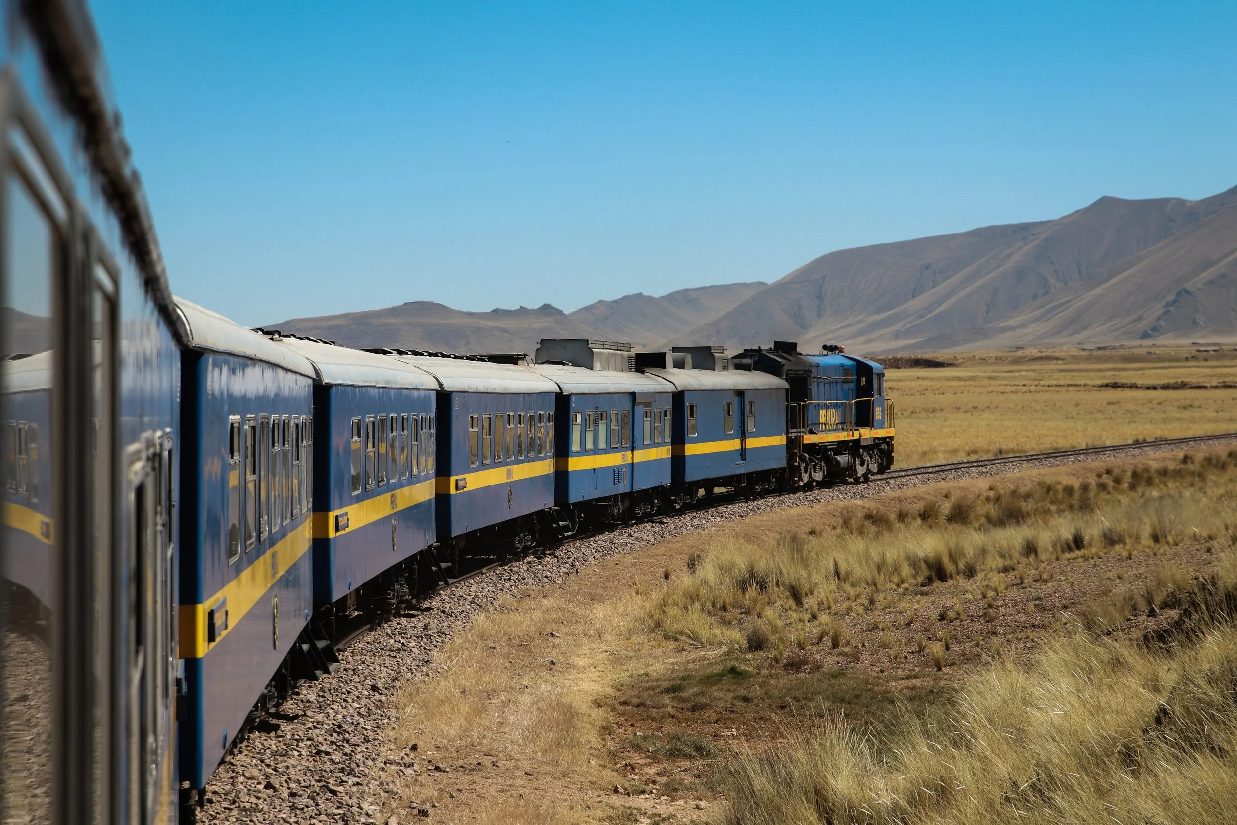
More space. Better Views. Direct to Destination.
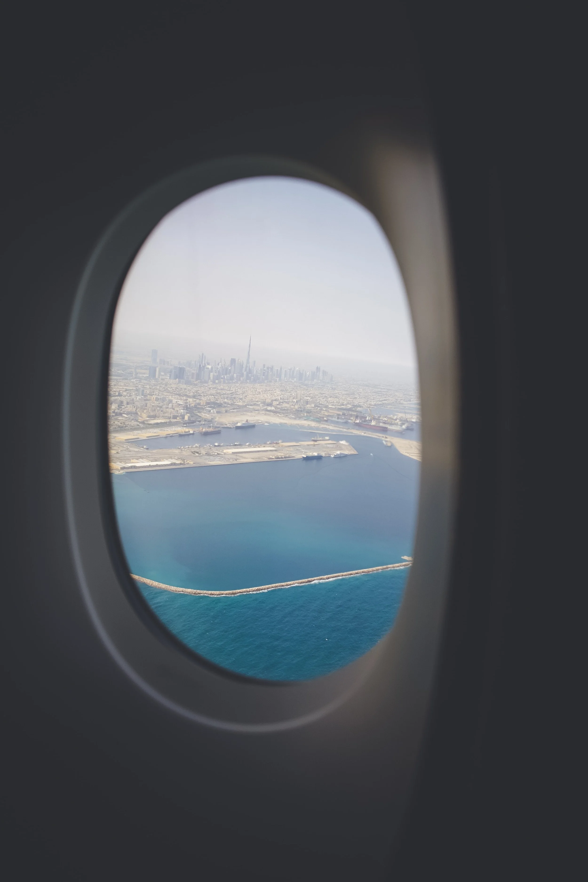
Users compared their train travel experience to airline travel. With trains, they could hop right on - there was no need to wait in line for security. The views from the train were prettier than the boring blue from an airplane. Most were able to get directly to their final destination.
“I take the form of travel with which I’m most familiar.”
Though users talked about little leg room, having nothing to see, inconsistent WiFi, and long security lines, they continued flying because it was familiar.
Our goal: create an Amtrak app that felt like an airline app
This would make train travel feel more familiar from the beginning. In order to understand how to do this, we created a task analysis with Jet Blue.
Jet Blue Task Analysis

Seat Selection
A journey map revealed that one of the biggest concerns was whether travelers would be able to sit with their friends and family. We created a seat selection feature that mimicked that of an airline app.
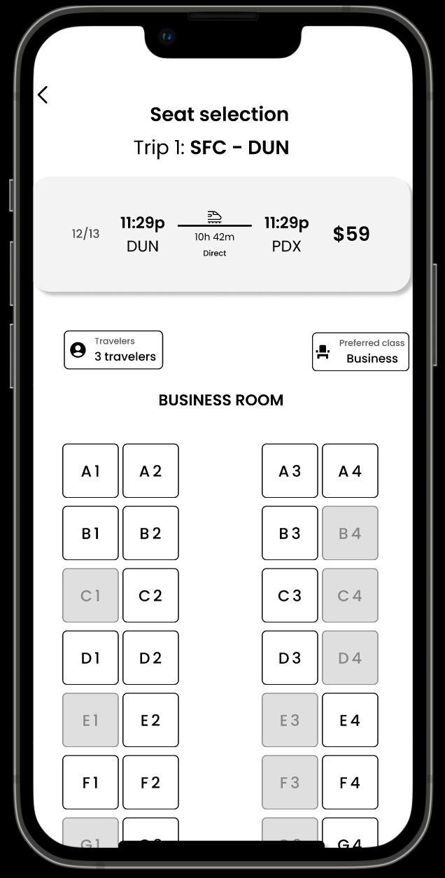
“I feel about this how I feel about airline apps…like I want it to be over with.”
We had succeeded in making the Amtrak app feel like an airline app, but we had succeeded too well. Whether in person or using Maze, usability testers felt as though they were done after 8 screens. We set out to reduce the 22 screens to 8 or less by using dropdown menus and accordions.
A Return to the Task Analsysis
When we looked more closely at the task analysis, we realized that Jet Blue had similarly condensed forms with drop down menus so that the user did not have to switch between pages.
The dark blue circles represent the same page.
Reducing Checkout Flow to Expected Number of Screens
We reduced the number of screens so that it more closely matched the users’ expectations by using accordions and drop downs.
View the Prototype.
This project taught me so much about teamwork, communication, problem solving, and visual design.
I worked two wonderful visual designers who taught me a lot about visual design principles, the importance of consistency, and their design methods. I learned about my own communication style and work habits, and I learned how to communicate my ideas visually to a design team.